Natural Wine and Graphic Design - What is the significance?
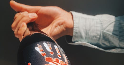
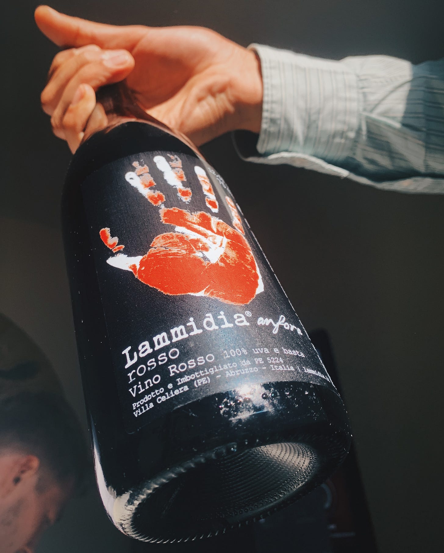
It’s usually the nuanced, appealing colours, obviously, then the enticing graphics on the label. Be it minimalistic and sleek like Tillingham’s, or aboriginal-inspired like Jauma’s, the label on a natural wine will always be one of the first things to grasp your attention.
I know, natural wine and graphic design…quite the odd, unassuming relationship when you think about it. But when you actually go deep on it, as I’m about to, you’ll realise that these two liberating industries have a whole lot in common. A lot of natural wine’s current growth is not only down to the high quality wine inside the bottle, but also down to their well-designed labels.
“They help to identify natural wine, and stand out from the traditional.”
Wiltshire Commune Wines.
To be clear - these natural wine labels are used as a marketing tool. Which isn’t a bad thing, it’s actually empowering. Independent natural winemakers are now utilising the technology they have at their disposal such as adobe flashware and freelance graphic designers to identify their wines. In other cases, to express themselves as true artists.
What stands out about the best labels in the natural wine scene is that they embrace all sorts of different aesthetics, you have the likes of Anders Frederik Steen who has gone down the minimalistic route with his simplistic, yet compelling designs and fonts.
Then there’s the contemporary/photography style label that a winery such as Testalonga in South Africa have with their unique pictures of baby’s and a guy in a swimming pool drinking a bottle of natty wine.
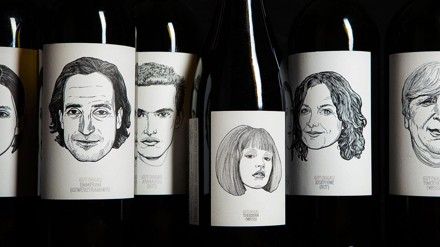
You also have the renowned Gut Oggau based in Burgenland, Austria who have chosen the hand-drawn, portrait style label and how could we ever forget Jauma (who produce my favourite labels) in South Australia paying homage to their aborginal descendants with some beautiful abstract, aboriganl artwork.
For decades wine makers have sought to express themselves, and more importantly, to express the wine inside the bottle through thought-provoking, well informed labels - it’s not just a ‘cool’, ‘natty wine’ trend… Take Pablo Picasso for example, he was once commissioned by Mouton Rothschild to create a label for their ‘Premier Cru Classe En 1973’, as compensation, he was paid 10 cases of the prestigious Mouton Rothschild.
Through a recent poll I conducted through the Natural Swill Instagram account I asked people “How significant is graphic design (i.e fun/abstract labels) to natural wine?”.
The feedback was more less a 50/50 split, some enjoyed the fun, funky-looking labels, others weren’t too fussed at all about what the label said and preferred to focus on what’s inside the bottle. In my opinion, I believe that what truly matters about a wine is what is inside the bottle, the grape variety, who the vigneron is and of course where the hell it was grown & produced. Although I can see why what’s designed or portrayed on the label of said wine can have a swaying affect, especially on newcomers to the movement.
“I don’t think it actually is, but think a lot of people who are maybe less clued up on wine can be swayed.” Kat Dickinson
Wine labels in all production styles, from mass-produced cheap wines, to the most hipster-looking natty ‘juice’, are specifically used as a marketing tool. It’s simple - winemakers use their labels to sell their wines in the best way possible.
Again, this shouldn’t be considered a bad thing, that’s just how business goes; you make the suitable changes and adjustments in order to make better sales.
Making the change on a wine’s label is proving to pay its dividends in some cases - winemakers are switching from their old, not-so visually appealing labels to well-designed, ‘cool’ labels, and it is making a difference. A recent illustrative redesign of La Bodega de Pinoso’s ‘Zillamina’ wines, which previously went by the name and design of ‘Flos de Pinoso’, increased their sales on the Zillamina range of reds, whites and roses by a whopping 250%, according to Abigail Glasgow at AIGA Eye on Design.
There’s also a romantic and compelling side to some of these ‘modern’ natural wine labels, I just think that it’s so liberating that an outspoken natural winemaker can provide themself with a platform whereby they can speak their mind through illustration. The more natural wine labels you research (before or after drinking the good stuff inside), the more you’ll start to form a relationship with these winemakers through their thought-provoking labels.
My final take on the significance of graphic design in tandem with the natural wine world is one of relevant significance. For me what’s most important when it comes to buying and drinking the right bottle of natural wine comes down to the personality and traits of the wine itself. But I do also believe that having a well designed, thought-provoking label to go alongside a high quality, memorable wine is a massive plus. It adds to the memory held onto by the final drinker. A wine with a cool label serves multiple services too, a lot of the most appealing wine labels I've ever drank managed to stick around my house as art fixations on the furniture, memorabilia of the best experiences and of course, slim candle-holders.


